A few of the many many web banners I created for Brown University. In each case I met with the department head in order to visually communicate each department’s mission with imagery.
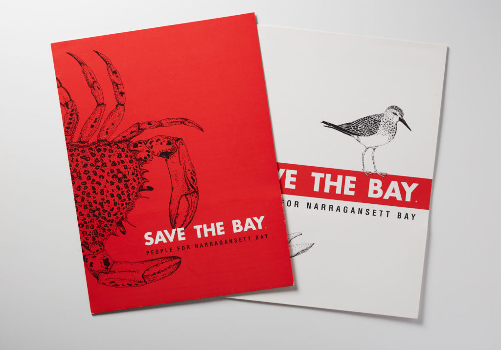
I loved creating this for Save The Bay. It was an opportunity to use traditional drawings of sea and shore life with a contemporary approach to color usage. Mixing these contrasts is something that I find visually exciting.
This Miami-based media development company worked throughout Latin America and wanted to have a food fun visual design style to express their creative approach to media creation.
Recruiter.com’s mission was refocused to connect people for career opportunities. That’s reflected in their new logo which has arrows showing the two way connectivity. This identity system also allowed for a smaller version of the logo “Re” for social media and other uses.
Creating the brochures for the Kenneth Jay Lane exhibition at the RISD Museum of Art was a fun project. The playfulness of his work allowed me to really explore a glamorous palette and type style that was so well received the museum used it in the exhibition space itself.
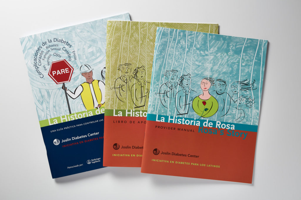
A practical guide to diabetes self care for spanish-speaking patients at the Joslin Diabetes Center in Boston. This project allowed me to work directly with their medical counselors on this complex topic.
Created a brochure for the John Nicolas Brown house at Brown University which highlights the historic importance of the building and its founder.
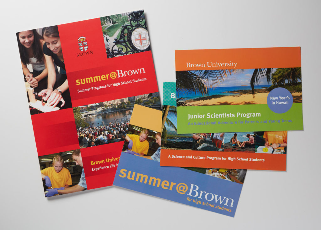
A series of promotional materials created to promote Brown University’s summer programs for teens. I worked closely with the program directors to make these effective.
When the creative director for Providence College took a leave of absence I was asked to step into this project and create their monthly alumni magazine. I loved the architectural details of the campus and used them as bold and dynamic visuals.